


OHV (One Hundred Visitor) is a coffee and dessert brand located in Riyadh, Saudi Arabia.
It aims to create an escape, to a peaceful and blue world, away from our problems and hustle and bustle of everyday life. We live in the midst of many stimuli and complications and we constantly need to recharge our batteries so that we can return to the world with more tranquility and happiness.
To be a visitor in this world is to slow down, recharge, enjoy your coffee in a moment of your own, you coffee and now.'' The brand's concept is the peaceful universe like the ocean, where you immerse yourself in a world of flavors and senses, renewing itself with each layer in which it descends.
OHV is born from the intense desire to create an escape, in the midst of time and space, away from our problems and hustles of everyday life. We live in the midst of many stimuli and complications and we constantly need to recharge our batteries so that we can return to the world with more tranquility and happiness.
That’s why OHV aims to promote this escape, entering a new world, where you will be protected and welcomed to recharge yourself in a moment of your own or with people who are good for you. A sensorial journey in search
of this fullness through coffees and sweets.
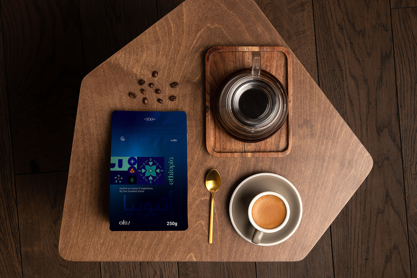
Strategy design, visual identity and packaging. Developed through our own "Homeostasis-Centered Design" approach, focusing on the concepts of Design Thinking, Emotional Design, Positive Design and Biomimicry.
Art Direction and Design: Diana Coe.
Design Assistant: Enayko Enellim.
Client: One Hundred Visitor.
Location: Saudi Arabia.
Design Assistant: Enayko Enellim.
Client: One Hundred Visitor.
Location: Saudi Arabia.
PT.
A OHV (One Hundred Visitor) é uma marca de café e sobremesas localizada no Riyadh na Arábia Saudita.
Ela tem o objetivo de criar uma fuga, para um mundo pacífico e azul, longe de nossos problemas e agitação da vida cotidiana. Nós vivemos em meio a muitos estímulos e complicações e constantemente precisamos recarregar as baterias para podermos voltar ao mundo com mais tranquilidade e felicidade.
Ser um visitante nesse mundo é desacelerar, recarregar, aproveitar seu café em um momento só seu, você o café e o agora.'' O conceito da marca é o universo pacífico como o oceano, onde você mergulha em um mundo de sabores e sentidos, se renovando a cada camada em que desce.
Direção de Arte e Design: Diana Coe.
Assistente de Design: Enayko Enellim.
Cliente: One Hundred Visitor.
Local: Arábia Saudita.
Assistente de Design: Enayko Enellim.
Cliente: One Hundred Visitor.
Local: Arábia Saudita.

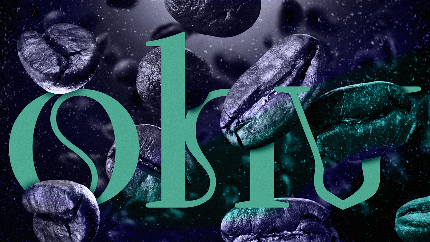
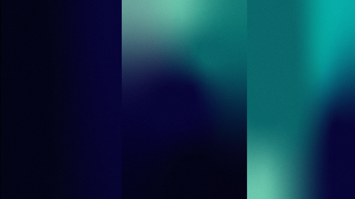
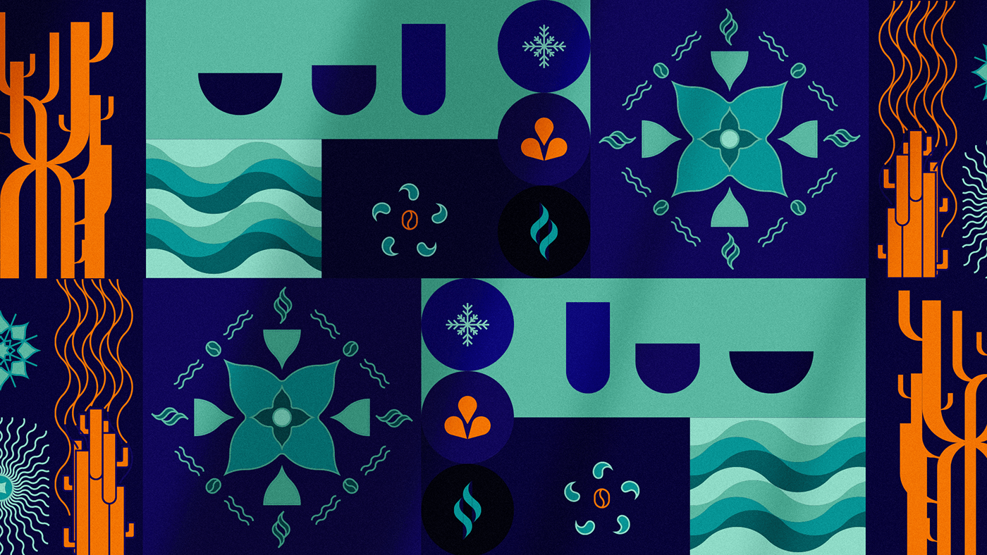
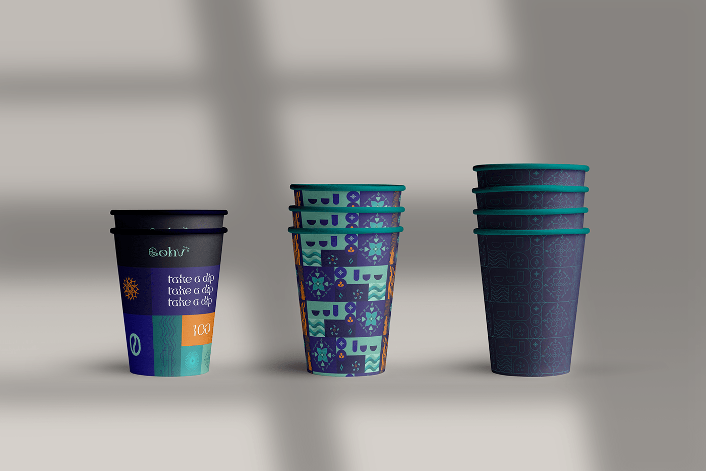
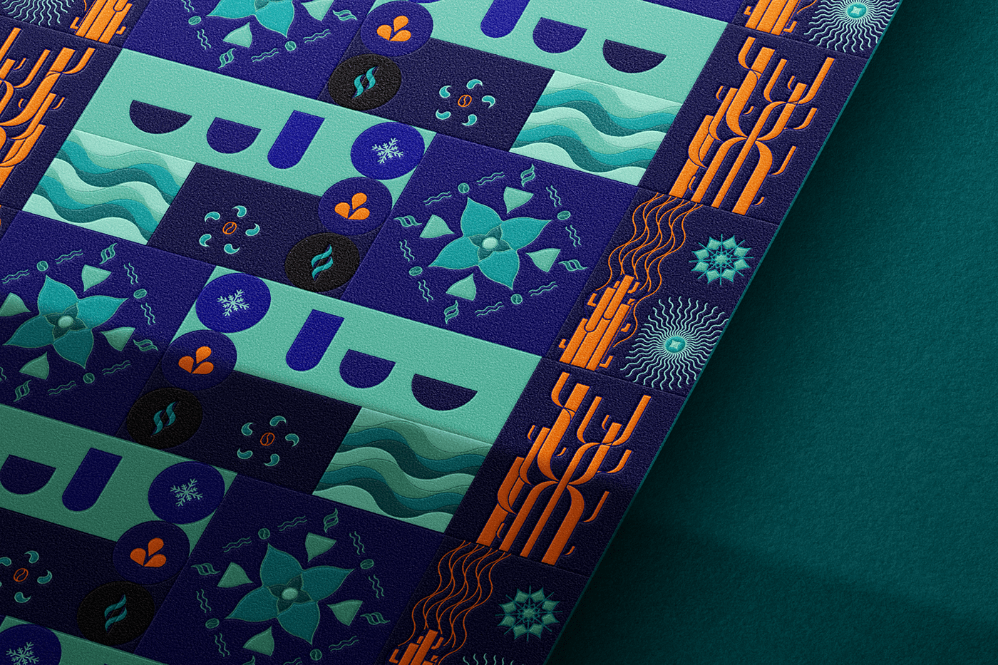
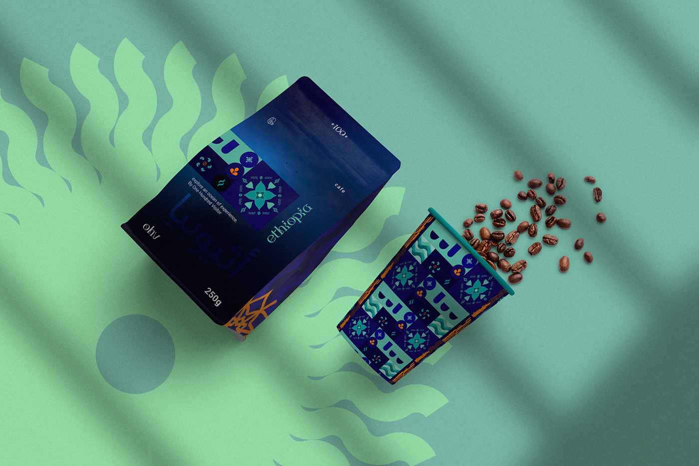
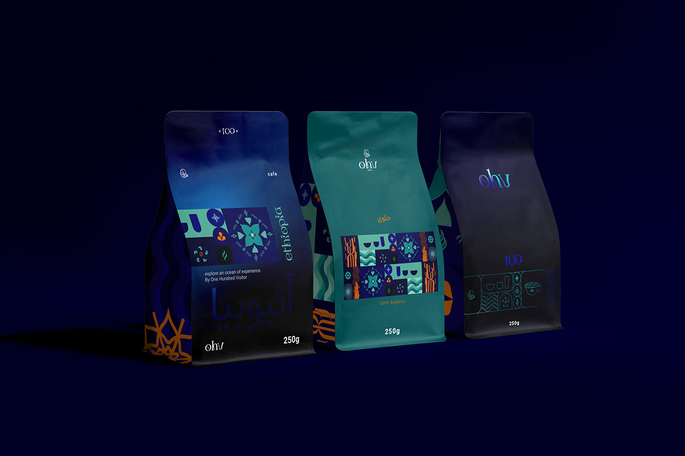
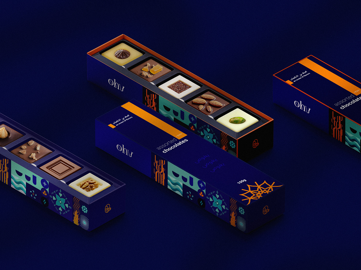
The colors of emotions.
The colors are a mixture of the depths of the waters and the blue immensity with the vivacity and contrast of the coral colonies, but without losing the elegance and softness.
Concept.
What if time could slow down so that we could renew ourselves in preparation for the next moment of the day? Whether it’s the need for more energy or intense peace and relaxation. What if this slowdown and a break in time and space were possible in a place that would become your refuge for renewal, a journey through flavors and senses, that would regenerate your life and your motivations. Every flavor, every texture, every vision and interaction is a positive journey that teleports you into this new world. And you can be the new visitor to this space. We create a universe that subtly moves between intensity and relaxation, sometimes alive, joyful and energetic, sometimes calm, relaxing and peaceful.
Every time you step into this new world it provides something new that awakens and intrigues you. ‘’Time stopped and I’m here now enjoying my coffee, the whole time stopped, all my problems stopped and I created a unique world for ‘’me’’ to enjoy my coffee, at this moment it’s just mine, me & coffee, is now.’’
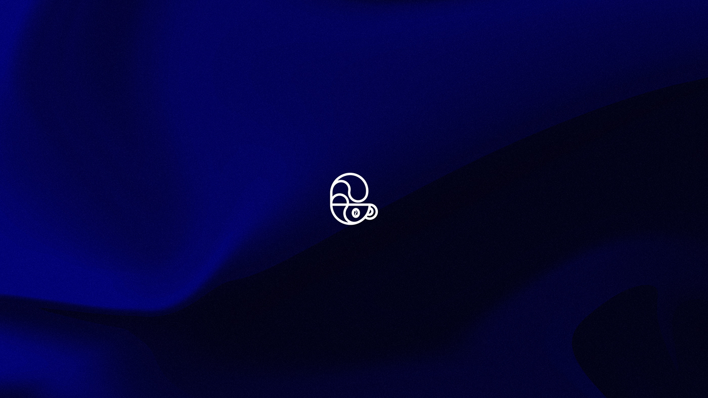
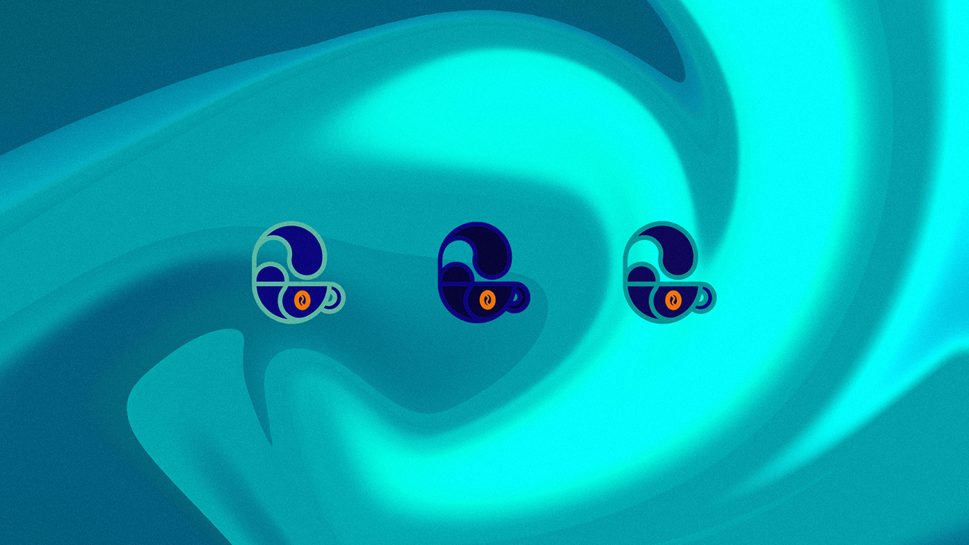

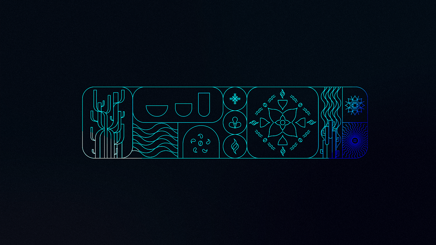
The symbol brings the complex simplicity of the brand’s three worlds, coffee and pastries with the ocean concept. The curves of the symbol semiotically bring the reference of something sweet, something liquid.
The symbol has good readability and accessibility. in addition to contrasting with the typography, bringing a unique essence. It can come either alone or with the logo, expanding the possibilities for using the brand.
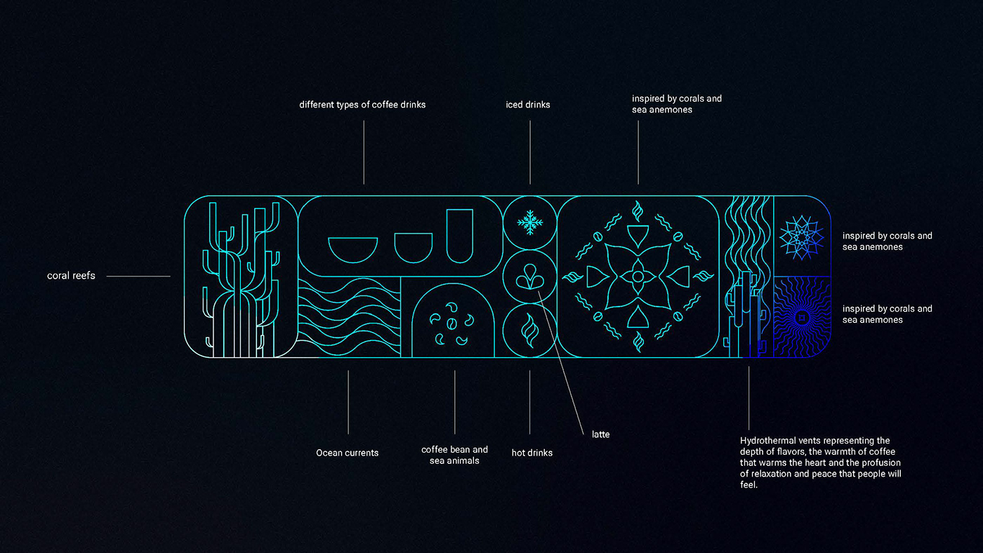
Using the concept of the pacific ocean in the cafe. Here we have a more daring alternative, which extrapolates a little more the differences of the cafes. Here we are going to really exalt the emotions of tranquility, peace, relaxation, of being in peaceful calm, a huge calm blue ocean in the middle of Riyadh, where people can go to escape their busy and stressful daily lives and put and sail in calm waters by flavors and senses, with a lot of life represented in each visual narrative of the identity.
The brand was born from the deep desire to bring peace, tranquility, energy and flavors to people. Here OHV takes its visitors for a dip in the blue depths of the ocean, traveling along the sea currents of flavors and senses.
A deep blue, which brings calm and peace to those who look, a moment of your own. A world of the pacific, where people renew themselves to return to their own worlds in a more recharged and peaceful way.
Supports visuals with marine elements, but always referencing coffee.
Here tranquility manifests itself in softness in some ways and energy manifests in others. Mixing vibrant colors of corals with the blue immensity.
Are you ready for that dip?


Thank you!
Do you want a project like this? Get in touch at hey@dianacoedesign.com
-


